Feb. 2021 - Mar.2024 UX Research & UI Design
Website / designed by Yiran Ren
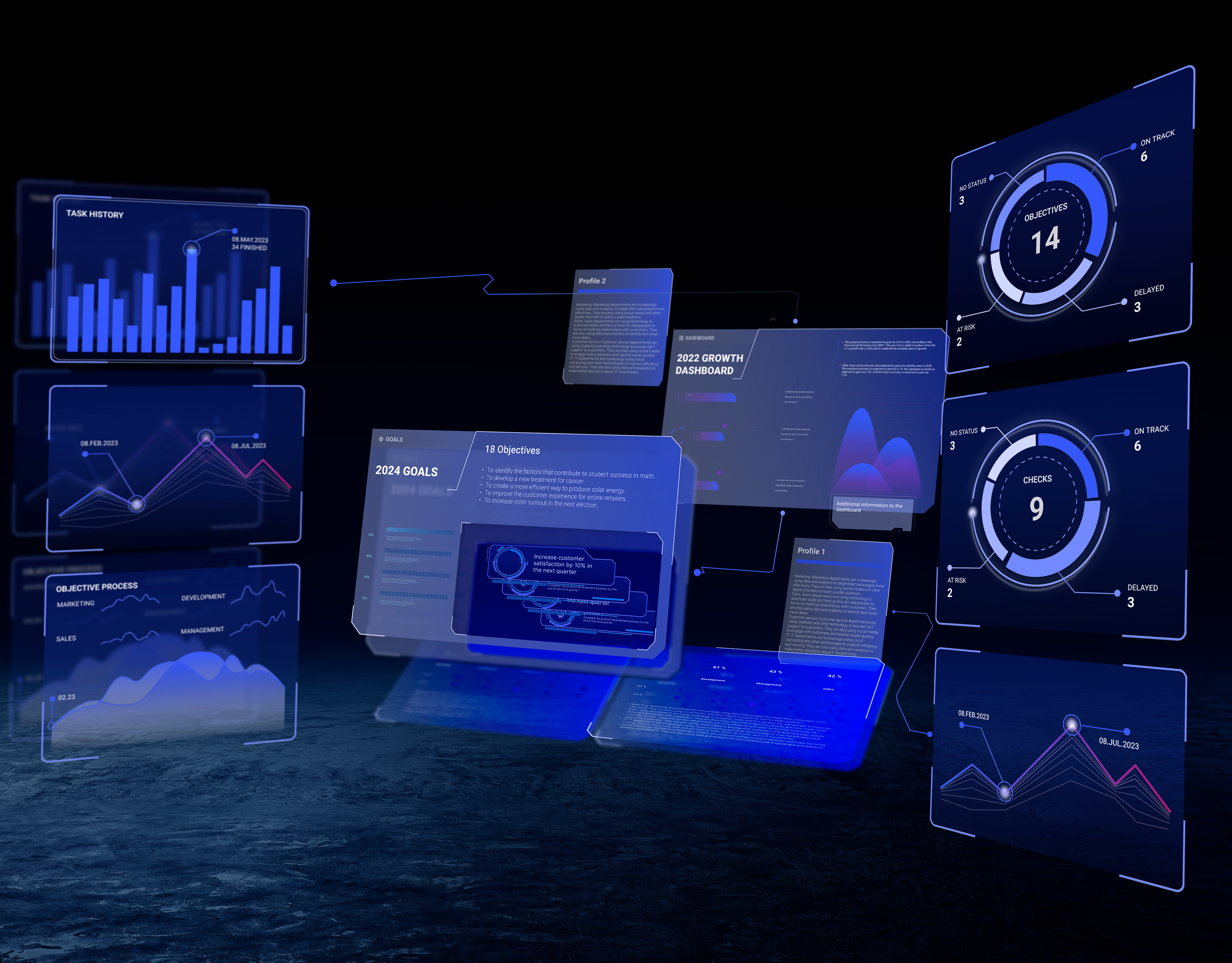
Galactify is a tech startup based in Munich. They are developing a project management tool utilizing 3D zooming technology and interface. They aimed to overhaul their entire website design in 2023, covering structure, content, and design style.
I led the entire design process for the project, which included creating the website structure, planning the content, creating design prototypes in Figma and Adobe XD, and implementing and launching the website with Webflow and Blender. The website has now been successfully launched at: https://www.galactify.com/.
Homepage:
The homepage showcases the key information and advantages of the products and the company. To help users better grasp Galactify's 3D zooming interface concept and align with the futuristic ethos, I incorporated Spline models into the webflow. This integration allows for scrolling animation effects, simulating a 3D environment on the website. Additionally, to facilitate swift access to the tool in alignment with the customer journey, we've strategically placed call-to-action buttons across various sections of the website.
To align with customer needs and capture their attention more effectively, I've simplified the presentation of our product benefits. By pairing these streamlined benefits with icons, I make it easier for customers to understand the core advantages they can gain from using the products.
Pricing page:
To assist customers in understanding the product's pricing, the website features a dedicated pricing page. Reflecting Galactify's business strategy, this page presents four distinct pricing plans. Each plan is outlined with its title, monthly cost, brief description, and a comparison of features. Tailored to different user needs, customers can engage with a call-to-action button to either start a free trial directly within the tool or contact sales for personalized advice. Additionally, at the bottom of the pricing page, there's a contact form allowing users to easily get in touch with the sales team.
Blog page:
Galactify plans to maintain a blog page to keep users and customers informed about company news. The blog will feature articles on newly launched products and their functionalities. To enhance readability, each post will begin with a brief introductory text, accompanied by a hero image and categorized for easy navigation.
Users can effortlessly filter blog posts by utilizing the category tags, allowing for faster navigation through the content.
At the conclusion of each blog post, users will find four recommended newest posts, enhancing the post's business value by encouraging further engagement.
Blog page:
As part of Galactify's strategy to convey the company's value to customers, users, and employees, I designed an "About Us" page. This page features call-to-action prompts, team information, a company description, company values, and links to recent blog posts.


